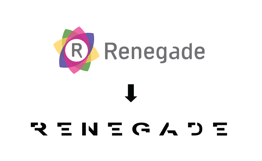
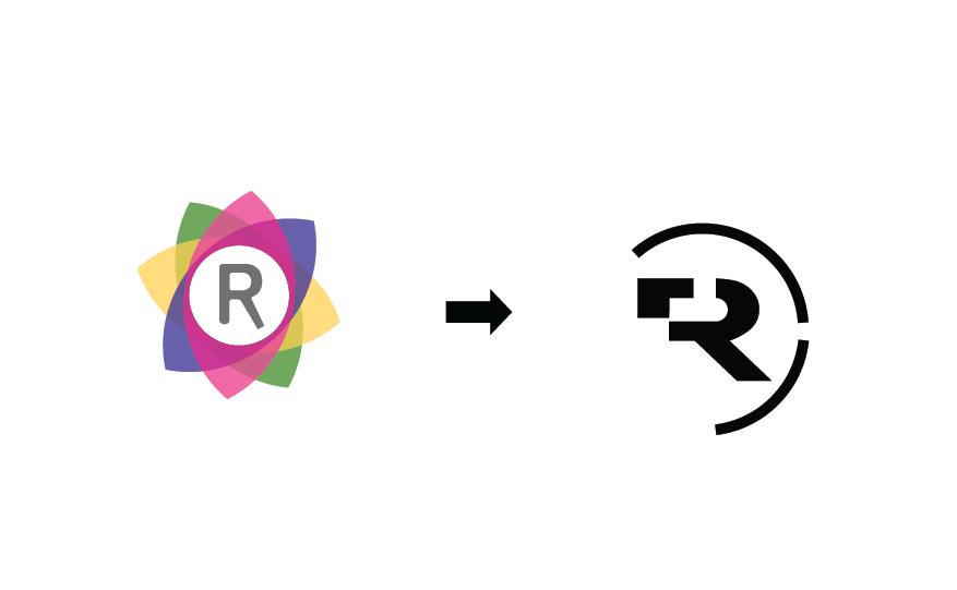
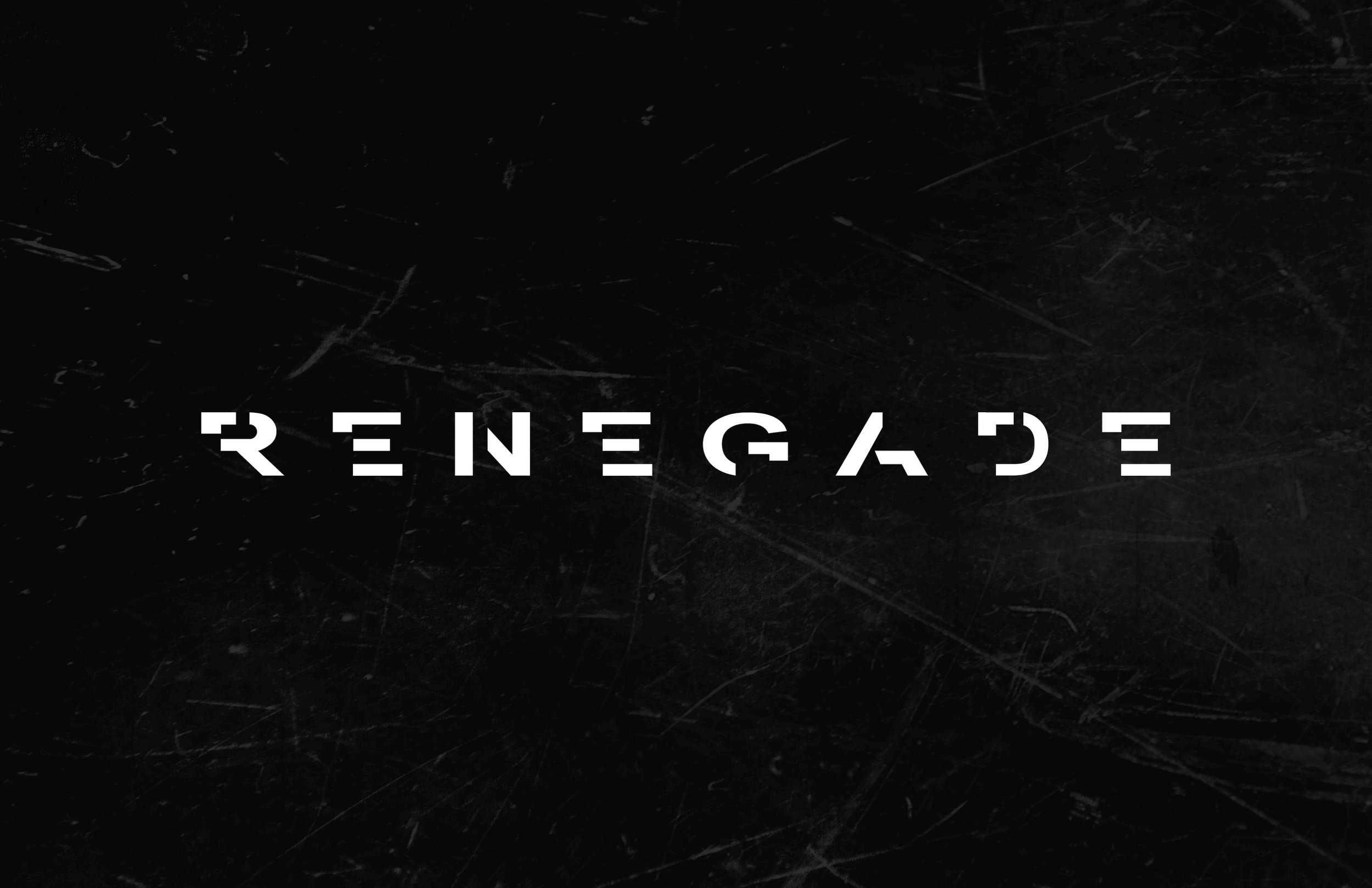
We rebranded Renegade’s look starting with the logo.
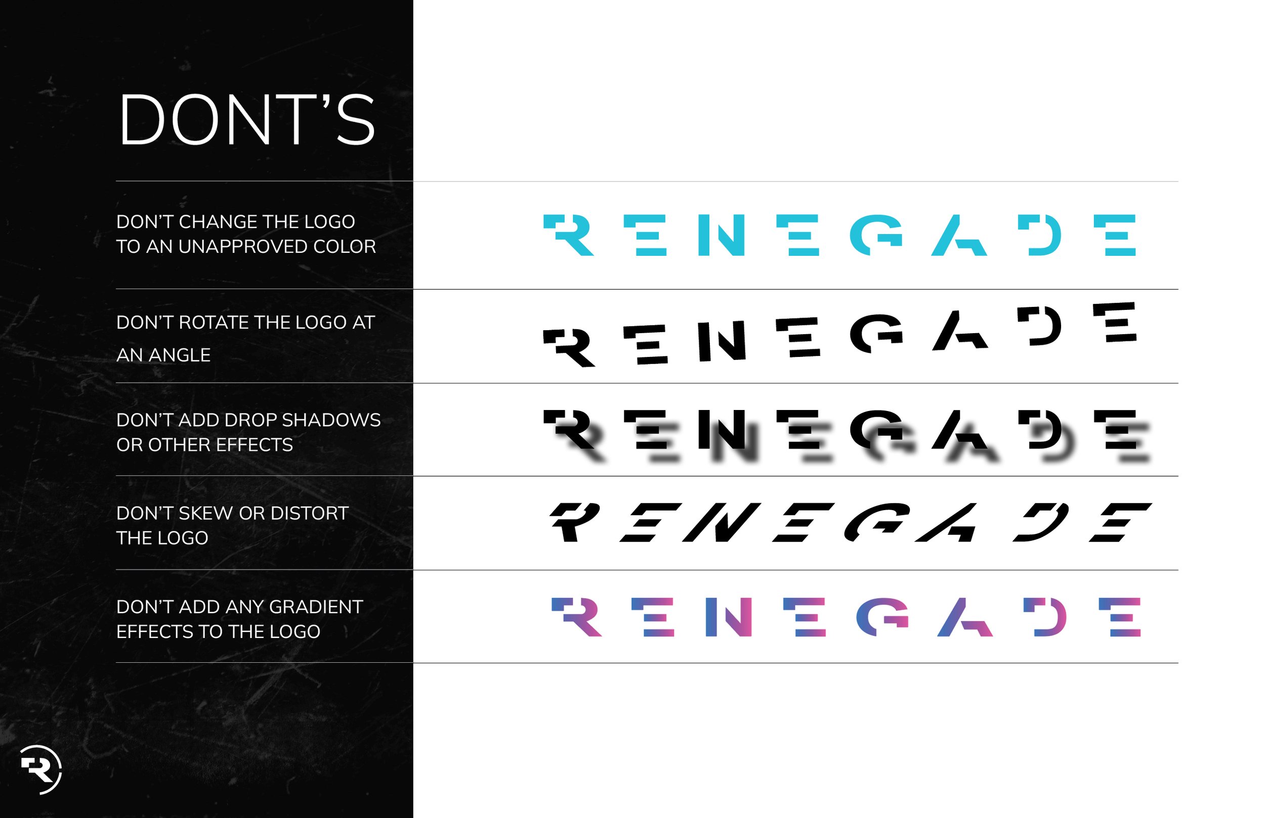
We moved away from the playful florette to the more aggressive, half formed letter logo. We felt it was a more appropriate look and feel and truly embodied the word Renegade. A company named Renegade doesn’t follow the status quo. Why would they even bother to form all the letters in their logo?
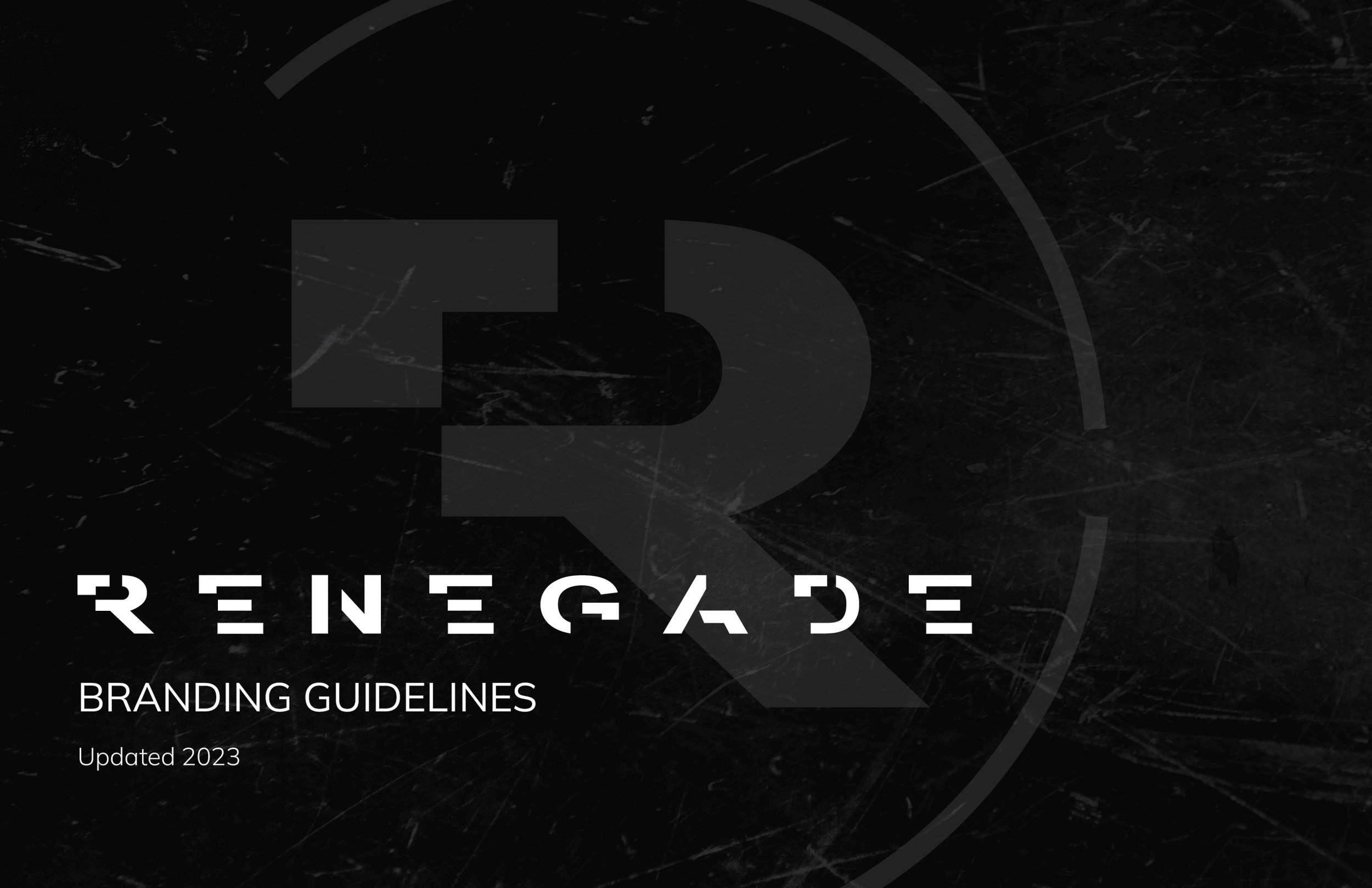
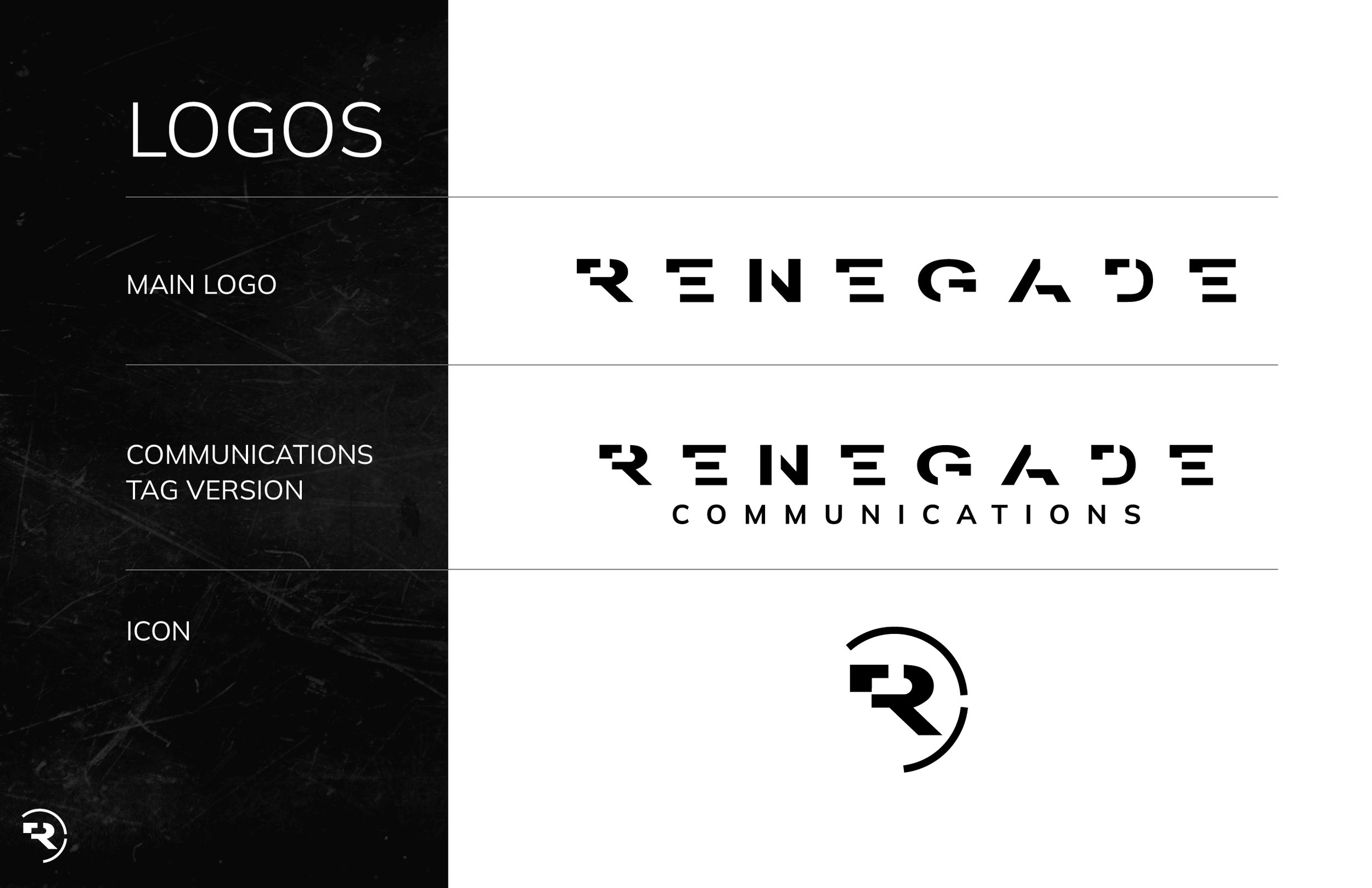
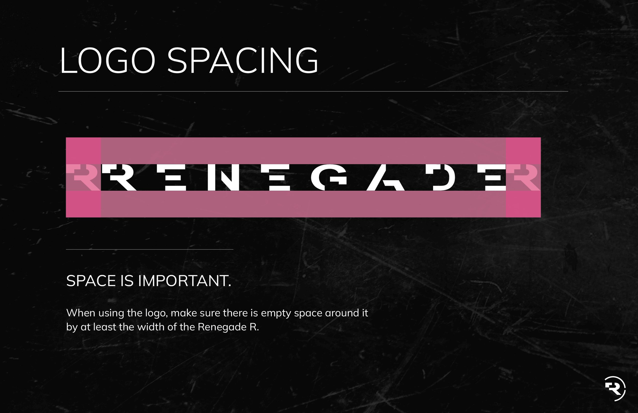
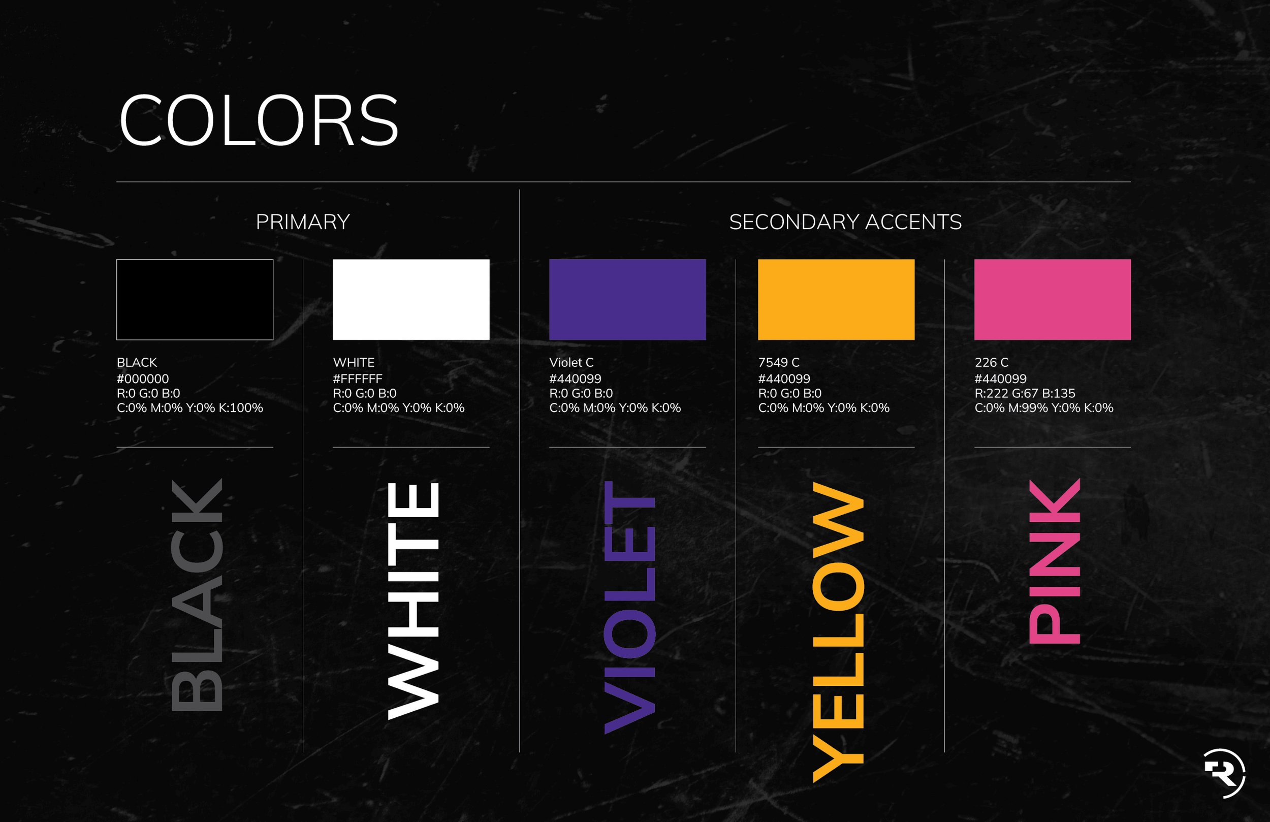
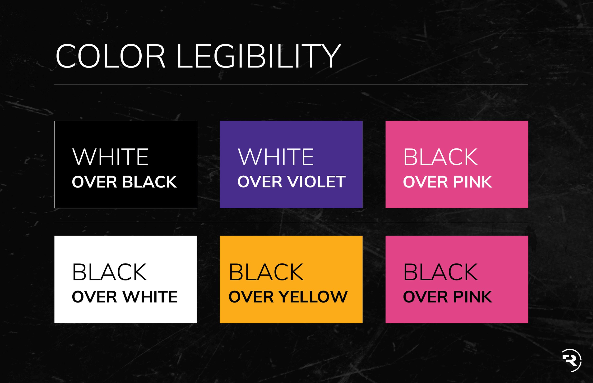
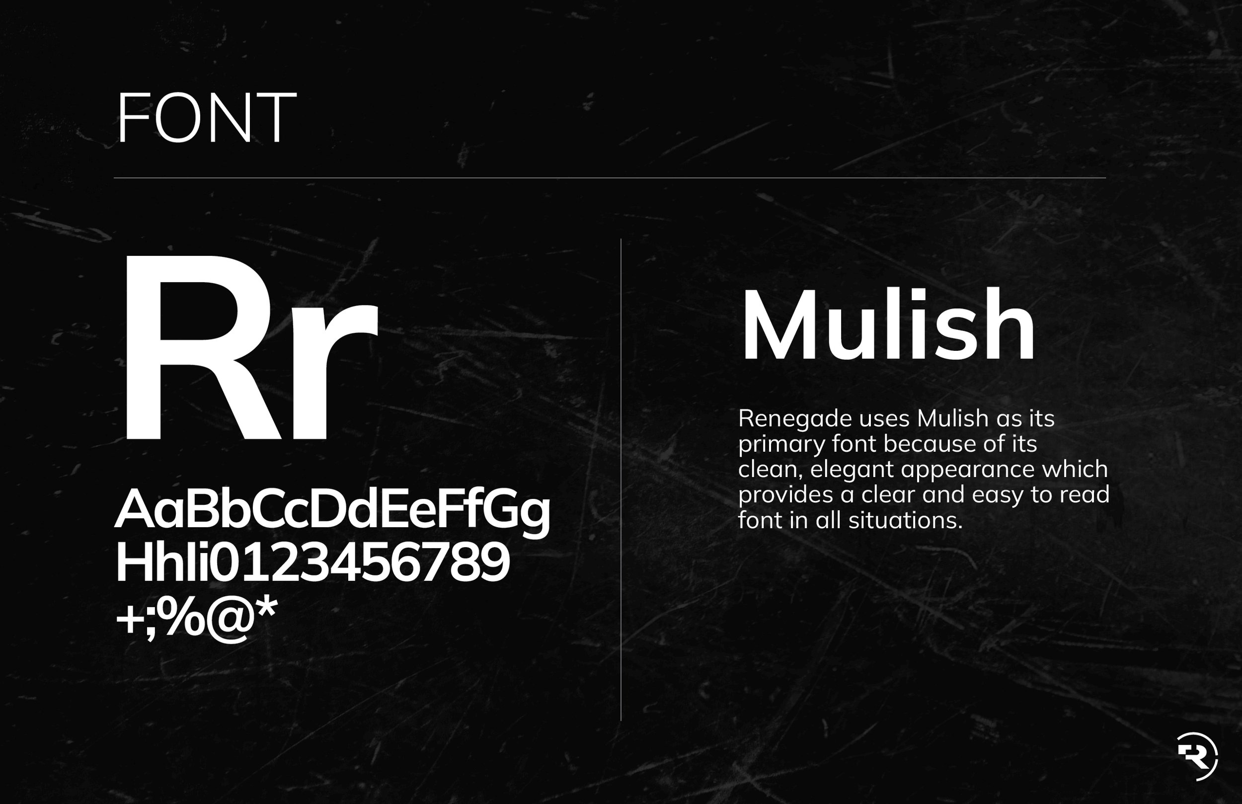
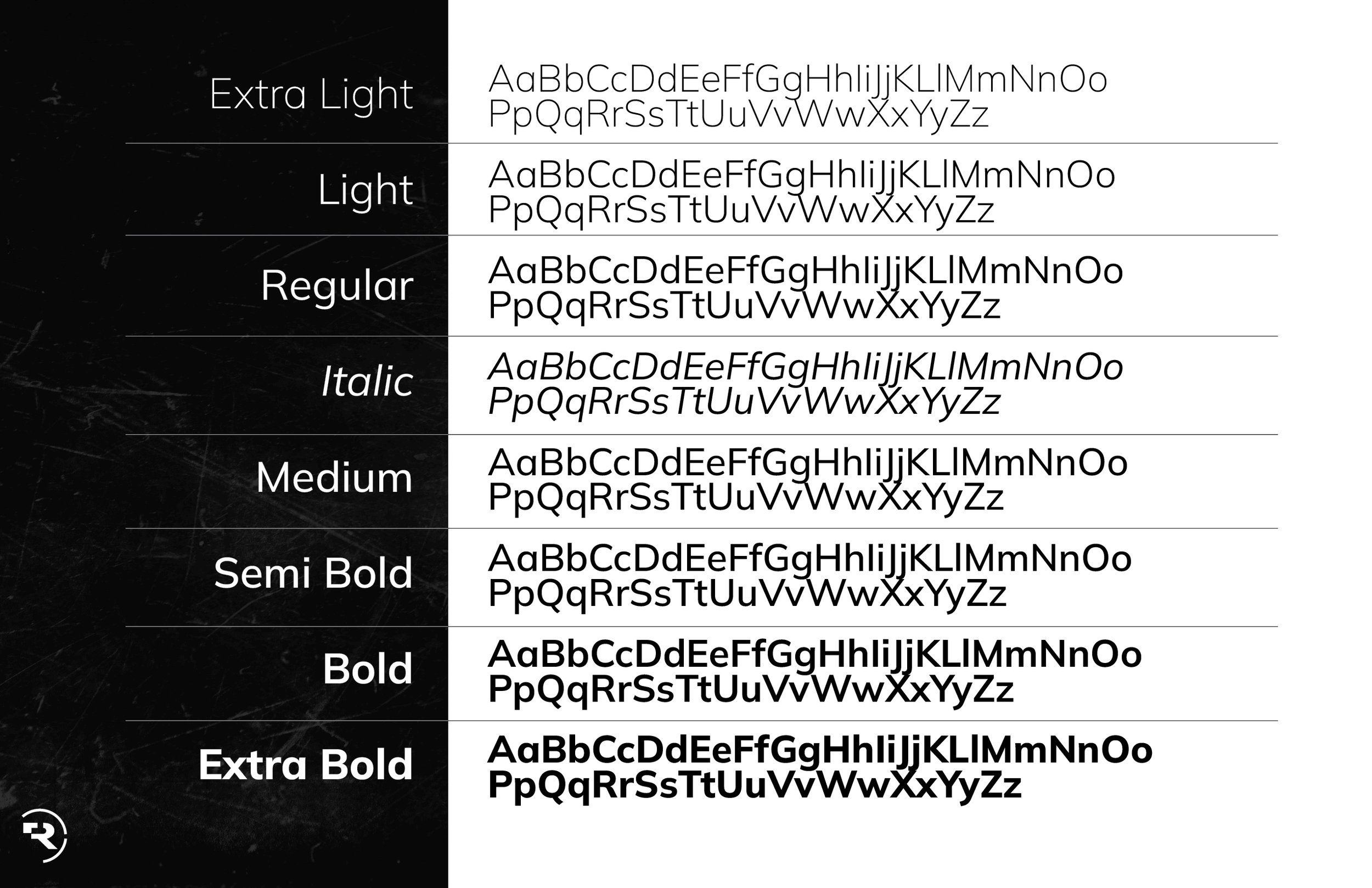
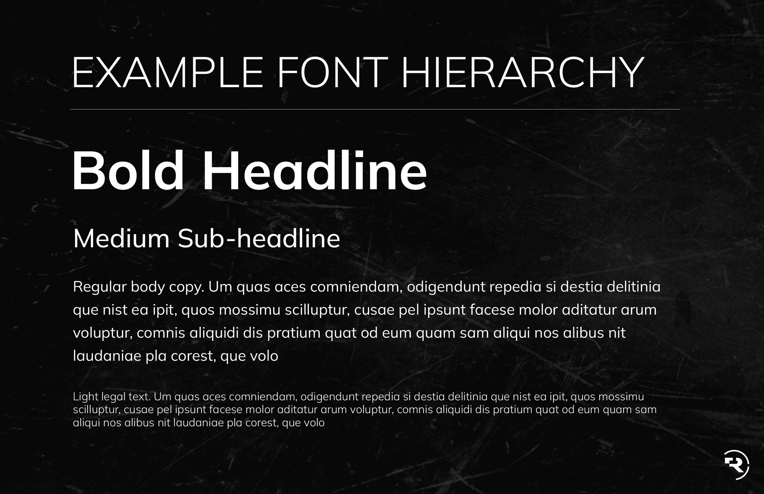
New branding guidelines
New Business Card designs

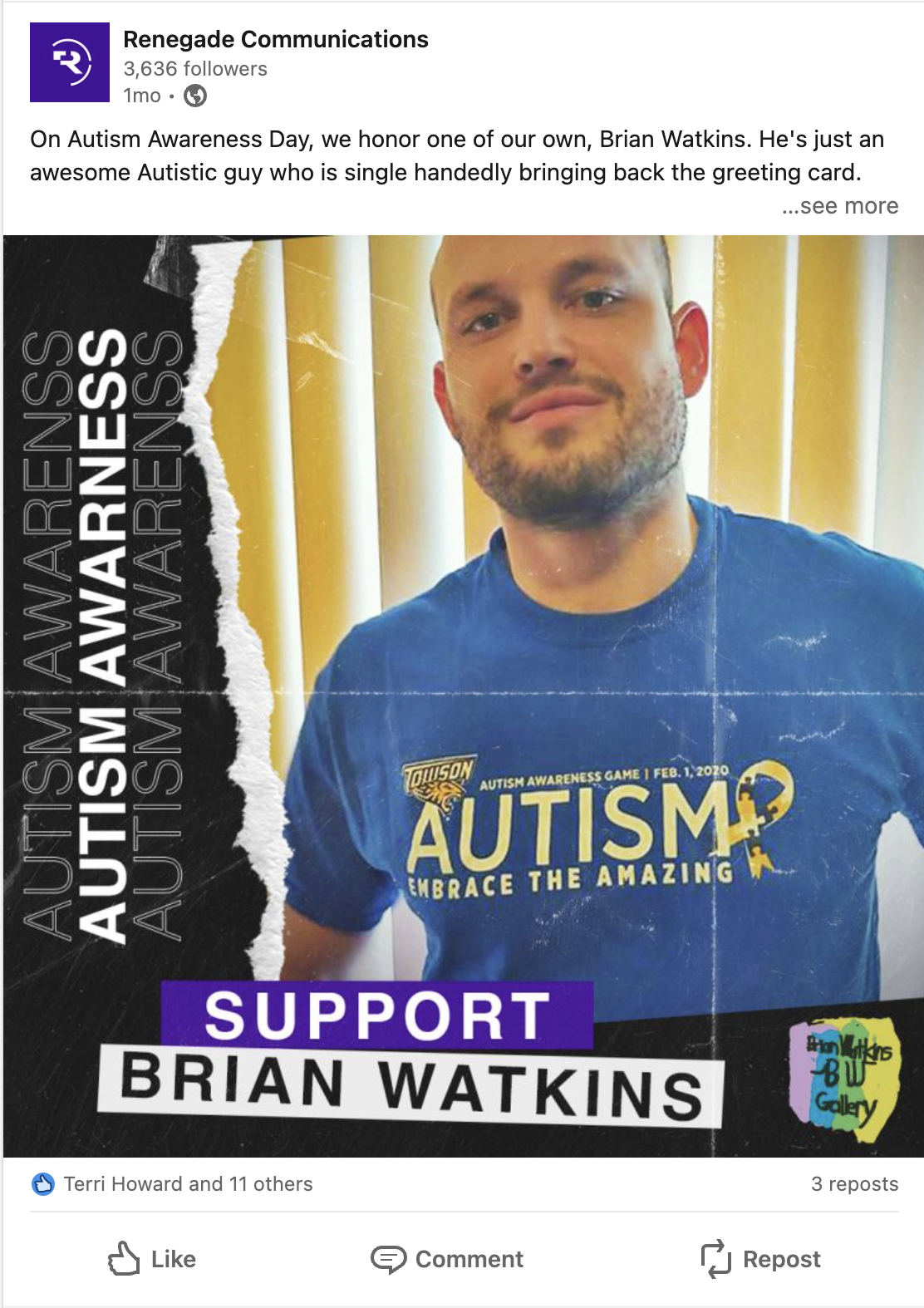
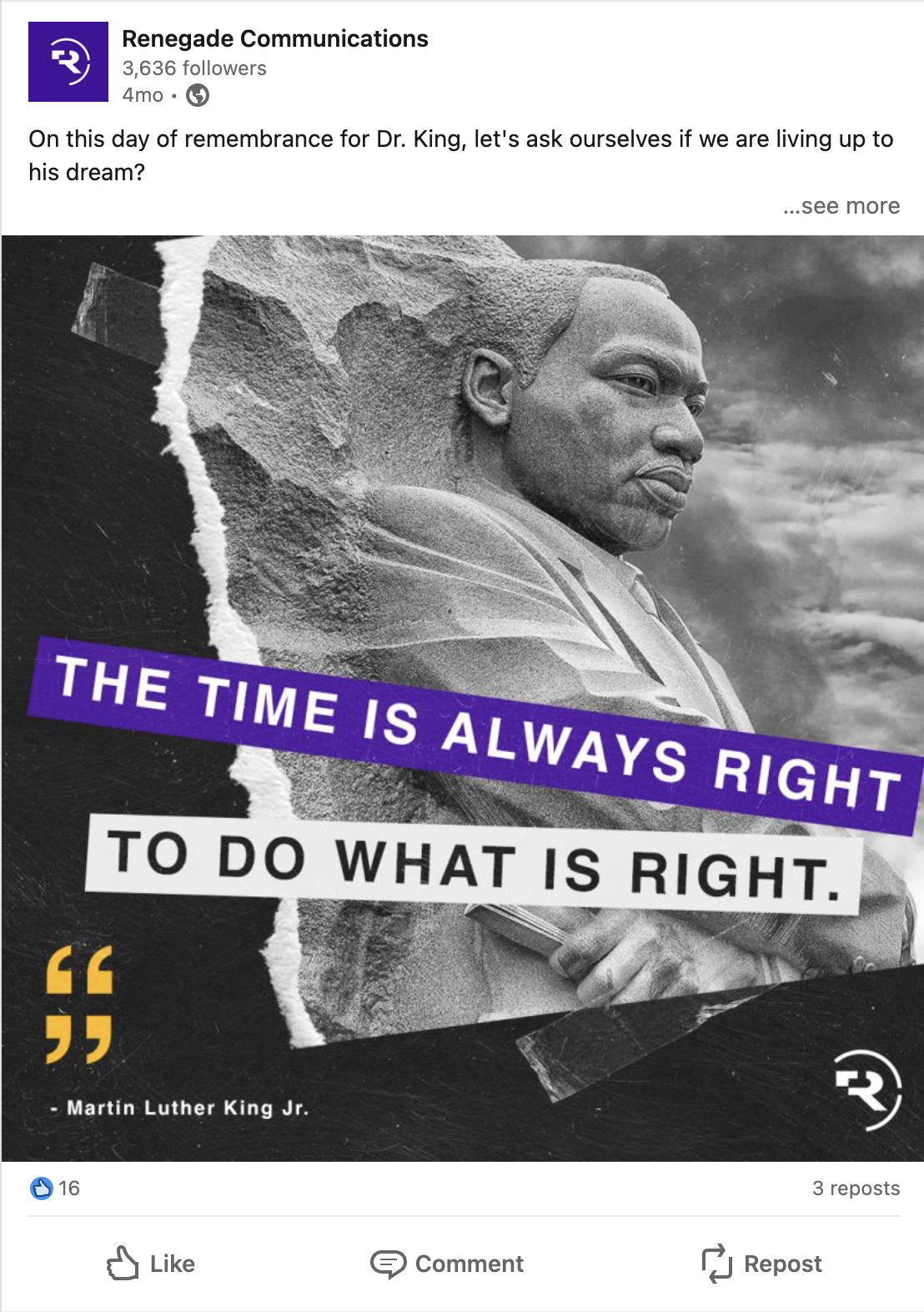
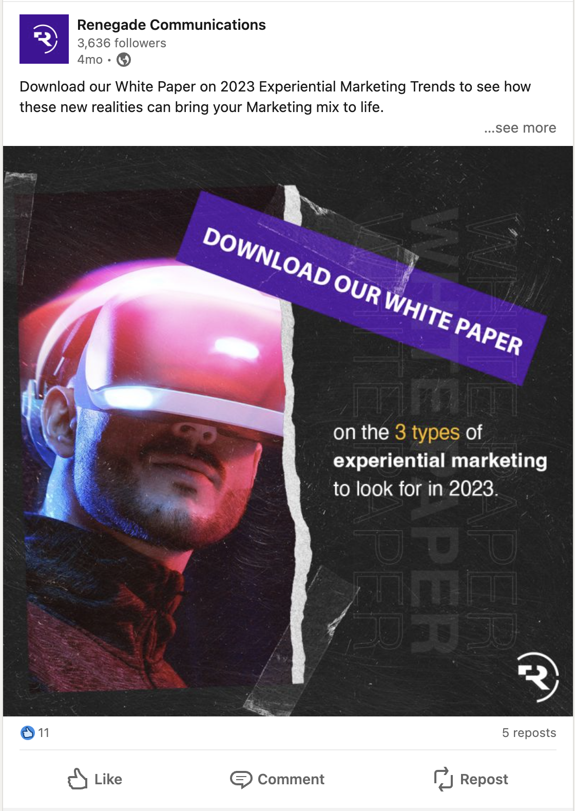
New social media design template